And very happily so. I find real pleasure in the making of paper pulp, moving the deckle through the water, a shake, flip it over . . . familiarity in the process has returned.
Sessions 1 and 2
Below in 4:7:1 is my first attempt at applying a sheet of freshly made paper to a piece of drawn thread work. When partially dry I split this by tearing through the middle and folding it back. Later, as shown in 4:7:2, I applied several partial sheets along the sides, overlapping them and piecing the shape into a rectangle. The piecing though didn't work particularly well as I omitted to press the surround as it dried. Maybe spraying it lightly with water and now pressing it would work?

4:7:1

4:7:1
 |
| 4:7:2 |
White pulp and white drawn thread work make for a very subtle effect. The preparation for smocking is what most immediately springs to mind and very subtley coloured threads will be needed so that the piece is not overwhelmed. Careful handling too as the piece is fragile.
After dipping several other smaller, softly coloured pieces in the vat I moved onto a piece which is a great contrast in colour and boldness and had already been partially machine stitched. Silk pins were used to attach the fabric to the frame, such a helpful tip and I found them in stock! Below the front and reverse are shown. Stitching on this piece will need a very different approach to the sample above.
 |
| 4:7:3 |
 |
| 4:7:4 |
The final example from this dipping session I want to comment on is below (4:7:5). I had several attempts at laying threads on freshly made pieces of paper. Initially the threads didn't adhere, but by putting a jay cloth and weight on the top I had more success. As a piece to stitch this gives fewer hints.
 |
| 4:7:5 |
Session 3
More dyeing, first using Jeans and China Blue, both knocked back as usual, this time with some Antique Grey rather than Black. When I saw the results after washing out I felt I'd been too heavy handed with the Antique Grey in combination with the China Blue as the result was rather dull.
I also added some different fabrics into the mix: scrim and by way of a complete contrast a heavy silk mesh. Both of these took the dark dye well. I then went on to draw threads giving the paper pulp interesting places to cling. As I saw the effect adding pulp had on each piece I've also been thinking ahead to Chapter 8 and considering how and what sort of stitching could be added.
 |
| 4:7:6 |
 |
| 4:7:7 |
 |
| 4:7:8 |
Images 4:7:7 and 4:7:8 show the front and back of the scrim as I scooped it through the paper vat. I did feel rather sad that my dyed composition seemed to be lost in the process!
 |
| 4:7:9 |
 |
| 4:7:10 |
 |
| 4:7:11 |
After the silk became thoroughly wet an the dyeing process it was easy to see the fabric structure. I was also able to remove threads and generally distort the fabric. I really loved the weathered and worn effect produced and even more so after the application of paper pulp. The piece became a stiffened curved form and individual threads had developed a wiry quality, twisting in various ways. I'm not really sure how stitching will enhance this. Even though I'll keep the piece on its frame if and when I stitch it it will probably soften, losing its form and substance.
The two images below (4:7:12 and 4:7:13) show five inch square wire frames wrapped with three thicknesses of string knotted together. As in the silk sample the pulp coated the knot tails, stiffened them and gave them a 3D quality.
 |
| 4:7:12 |
 |
| 4:7:13 |
Knots:
Both in sample 4:7:12 and 4:6:11 I used knots: to tie lengths of string together or to finish a length of embroidery thread. I do like knots: long tails going off in different directions, the twists and turns made in their formation and their general untidiness which adds texture. It's interesting too to see how the pulp clings to them. Perhaps this is an idea I can work with when it comes to edges.
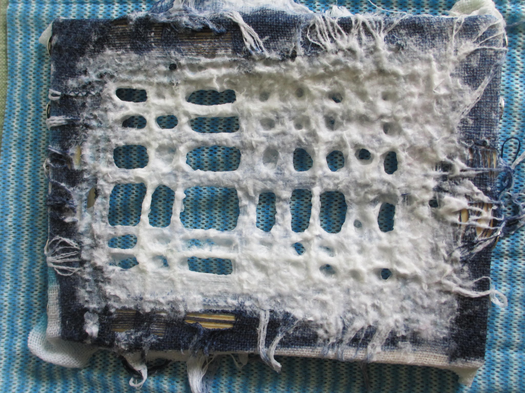
The three images below show fine white netting stretched and tied on to a wire frame. The netting is very fine and it's surprising just how much pulp it supports. It's interesting to see that sense of directionality in the way the holes are very obvious in the bottom left hand corner of 4:7:15 (the reverse) becoming more random towards the top right hand corner. Hopefully my stitching can exploit that.
 |
| 4:7:14 |
 |
| 4:7:15 |
 |
| 4:7:16 |
:Using Coloured Pulp
The final three images show some experimentation with coloured pulp. I wouldn't say that it was a very successful session. The blue I made with some beautiful paper bags, contrasted too much with the white and I probably need to do some pulp mixing to tone it down. Though, of course, stitching could also solve the problem. The piece also needs pressing for longer to embed the layers and make it more stable for further work.
I've learned a number of other things. By using a shallow pulp vat (in this case a cat litter tray) it is easy to make partial and quite thin sheets of paper, but what I did find difficult was scooping up paper pulp with my hands and trying to apply it either on top of existing paper or to cover small gaps. The effect was reminiscent of applying putty!
 |
| 4:7:17 |
 |
| 4:7:18 |
 |
| 4:7:19 |


