Wednesday 17 February 2021

Chapter 1: Texture in Landscape 1

So having decided on the where, I now need to think about the what and I have a book of Nevada images on my shelf which will help with that.

It's individual textures in the landscape, rather than categories that I'm attracted to at this point, wanting still to do a little second guessing and trying to choose something which will work with the techniques in future chapters.


1:1 Drying Mud in a Wash


1:2 Bark of a Ponderosa Pine

My mind's already thinking about layering and cutting back.  I test the images out in black and white, and then I crop, one thing leading to another.  But, as I reread the instructions I realise I may well need more than one image in my chosen "aspect" and mud is not bark.  I need to think again.  This time I'm into grasses.  


1:3  Fergusson Mountains


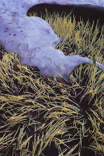
1:4  Winterbrown Marsh Grass


1:5  Mount Rose

There's nice variety too: seed spikes strong and thrusting towards the sun,  the rustle and movement of Winterbrown Marsh Grass and finally, the grass at Mount Rose (where our grandchildren ski) which is trying to recover from the weight of snow.

These are very different images from those of mud and bark.  And this is what I notice as I go through this process of "getting my eye in".  I'm looking at depth -- background, foreground and midway between.  I'm seeing movement, as I've already commented.  The grasses also have other qualities: short and tufty with narrow stalks (possibly hollow) with a spiral of ripe seed heads twisting round the upper third.  The marsh grass is broader bladed, dry and possibly beyond harvest time, narrowing to a point, each blade curved and arching over.  Where the snow has melted at Mount Rose the grass still seems damp and flattened.  For all that it still has movement, blades are clumped together and arch as the sap starts to rise.  The time of year creates an atmosphere, tells a story.

Moving on from these initial images I turn to Photoshop, make them back and white and then play with them in the filter menu.

1:6  Fergusson Mountains


1:7 Winterborne Marsh Grass


1:8  Mount Rose

I don't intend going over these sequences in any detail however, I would like to comment on the second row far left of Winterbrown Marsh Grass where Poster Edge treatment reveals some rather lovely markings on the blades nearest the camera. There are a number of further things which also spring to mind and  might be useful when interpreting grasses in stitch.  Firstly, the sense of rhythm in each one is made very clear.  Secondly, these versions show what is specifically in the foreground and thirdly, their tonal range.  As ever with these exercises, it is surprising how much inspiration there is in such a seemingly mundane thing as grass.  How could I possibly say that when I've written the description above?


Now to rocks, they're mountain ranges really.  Below is Cathedral Gorge, and below that two black and white versions.


1:9  Cathedral Gorge


1:10


1:11


And here are falling rocks in a Canyon, first in colour,then black and white versions.


1:12  Canyon


1:13


1:14


1:15  Within Lovell


1:16


1:17


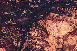
And then there are petroglyphs, those 10,000 year old rock paintings.


1:18


1:19


1:20

Postscript:

I'm adding three further black and white photographs which were taken and sent by my daughter.  The light was so bright that in addition to converting them to black and white I've had to intensify the contrast, even so it seems to me these images lack the drama of those above.


1:21


1:22


1:23


Module 5: Looking for a Landscape

 A thick coating of snow is covering the ground and we're locked down at home.  I take the camera out and look for textures, but any textures I can find are blurred and blanketed in white; the images aren't even worth downloading.  I need to think more flexibly if I'm to make a start.  Images of bright blue skies, wide vistas and mountains come to mind - perhaps in Nevada there are textures, and it's warmer there.

We have family who have lived near the Nevada California border for nearly twenty years and we have visited many times.  Days there start with a pink blush on the mountains and shadows on the wall.  Journeys are long and the landscape expansive. We've driven along wide valleys, fast flowing rivers, the sheer rock rising high above us; the colours are warm.  Watching the premier of "News of the World" last night I am reminded of the illusion such a landscape can be. How to the uninitiated eye  wide and cultivated-looking valleys are in fact high desert, bands of water resistant plants are all that will grow. 


Osgood Mountains


 The mindset necessary here is not that of the tourist wanting to find ponderosa but of the pioneer choosing between the Oregon trail or the one leading south into California and two very different lives.  The ruts caused by wagons are there in the rocks. 


Petroglyphs


 And on the rocks is evidence too of other lives: petroglyphs, scratched or carved, signalling the presence of Paiute Indians, also the makers of intricate baskets seen in the local museum.  There are rich pickings here -- I have mined them before.


5:1:1

Above a silk patchwork cushion cover suffering from sun damage. It's been repaired using kantha stitch, then further stitched at right angles in kantha to indicate mountain ranges.  Sage brush, the Nevada state flower, is embroidered in thick brown thread.

Below, a second cushion, this time made from velvet scraps I was given.  I chose colours reflecting the rock formations, the light and desert heat.


5:1:2


Sunday 7 February 2021

Chapter 13: Thee Artists

 Cas Holmes

I have two books on my shelf by Cas Holmes: "The Found Object in Textile Art" (2010) and "Textile Landscape Painting with Cloth in Mixed Media"; her most recently published book "Stitch Stories Personal Places, Spaces and Traces in Textile Art" is on my wish list.  Her philosophy is there in the titles.  For instance she does not distinguish between art and craft.  Instead she uses  her drawing skills (she has a Fine Arts Degree) and those of working with paper (she did two periods of long-term study in Japan) and combines these with other materials to convey meaning.


13:1 Cas Holmes

Cas Holmes work is informed by personal experience, places she's visited, her Romany grandmother and old and forgotten textiles.


13:2  Domestic Mapping

Cas Holmes is also interested in the interface between the natural and the built world, the seasons and man's impact on the earth.

13:3  Winter Grasses

Much of the material in Cas Holmes' pieces is reused, often crumpled and torn.  She re-purposes such items, organising,  rearranging and layering them with other materials, cutting and piecing, then drawing with stitch to express her thoughts.  Her finished work is tactile and atmospheric, suffused with light.


13:4 Trees

13:5  Urban Nature


All aspects of Cas Holmes' work serves its meaning:whether as a book, hanging, or individual art work.  Although she keeps a sketchbook each new work is not pre-planned but is given time to evolve.


Lois Walpole

 Lois Walpole is a designer, maker of baskets, furniture and art works.  The artefacts she makes combine the techniques and often the forms of basketry with the detritus of consumerism and the natural materials of her immediate environment.


13:6  Lois Walpole

In doing research on Lois Walpole I came across a radio interview in which she talked about her practice.  She is a free-lance artist who also curates national and international exhibitions.  In addition to her own work, she makes to commission, her creative work a facet of home life.  She also writes and teaches.  Exhibitions are a driving force behind her work, which she comments has no point unless others see it, though she speaks cautiously about selling her work.

As her practice has developed she has moved away from using natural materials, drawn by the bright primary colours of waste which was so easily available in London where she used to live.  (She now splits her time between Shetland and France.)  Sustainability is a key feature of her work and though she still grows some materials in her garden, the majority of those she uses are recycled.  The essential point is that she no longer buys any materials. 

 Lois Walpole's work is shaped by what is available. The surfaces of each piece are decoratively rich and beautifully finished, giving no hint of the material's origin.  This work began with juice cartons and as is illustrated below, now encompasses anything and everything.  Through the skills of the maker and basketry techniques inconsequential used items have been made new.  Not all of her work is small, during lockdown she has been working on repairing a sofa, doing 155 hours of work without any expense!

13:7 Coiled Bowl 
Crown caps and wire


13:8  Handy Numbers
Telephone Directory, plastic sleeves, camera strap, computer key


13:9  Pokeys 
 Found ropes from the Weaving Ghosts Exhibition 2016


More recently Lois Walpole is directing her attention to preserving basket making techniques and passing them on.  She is also looking at the repair of baskets.  

Lois Walpole is also involved in the world of education, from A-level to contemporary design courses.  She would very much like to educate the general public about basket making and the skills required, suggesting doing this in a television programme.


Magie Hollingworth

Magie Hollingworth was a maker from childhood, dressing her dolls in handmade clothes as well as furnishing their house.  After a Fine Arts degree in painting she returned to textiles making works in paper mache and in the last twenty years has become a designer of tapestries.  Magie Hollingsworth talks about being self taught  and materials led, exploring wet paper and wool and gradually, in her words, "making progress".

The way an artist works is revealing. When I hear them talking I hope to find advice or have my own evolving ideas confirmed. Magie Hollingsworth has many enthusiasms -- paper, tapestry design, her garden, about which she is passionate, and cooking.  Her approach isn't single-minded, each train of thought feeds the others.  She even points to the holes in her tapestries commenting that they not only appear in her paper vessels but also in the clothes she chooses.   

Having a concurrently running number of activities in her making life does not indicate a laissez-faire attitude.  Magie Holingworth responds to the discipline of deadlines.  She also comments on the need for boundaries, the necessity of limitations.  She doesn't keep a sketchbook.


13:10  Magie Hollingworth


It's indefinable the way one is drawn to a piece of work.  We have a lovely gallery in one of our nearest small towns called Bircham Gallery, which retained its name when it moved to Holt quite some years ago.  What I noticed on display was a vessel: a pod shaped piece that at first I thought was ceramic, but when I picked it up, it was oh so light and turned out to have been made of paper.  It's fourteen centimetres high, eight centimetres at its widest point, the surface ridged from base to top and a beautiful matte but rich black-brown hue.  Its proportions are beautiful.  Its lack of symmetry is pleasurable to my eye, speaking as it does of the times through which it grew, the weather that shaped its growth and seeds it may well have harboured.

                                                                                  
13:11  The One I Bought


13:12  Subsequent Versions


The vessels below are also appealing:  I like their fragility and translucency.

13:13


Not all Magie Hollingworth's work is in neutral colours.  In the two works below she uses pages from vintage albums to decorate her paper works.

13:14


There is a playfulness in these last two works, subverting the function of the practical into something purely decorative and saying something more through her choice of surface material.

On the whole Magie Holingworth's colour palette is muted.  Beach colours are her favourite -- the greys and steel blues of a calm environment lifted by bright accents.  Realism and surface quality are important to her, as is the stitch by stitch creation of her tapestries.


Chapter 12: Authentication of Work

 Artist at work: the very final phase of Lost at Sea.  

The book needed a long shallow box, so I set to and made one using what was to hand.  White card wasn't available so I used thick paper reinforcing the sides by folding a double layer which improved its rigidity. 

In this image I'm covering the box lid with torn pieces of left over handmade paper which will then be washed over with a coating of PVA and water. The book's title will be centred on top.  After thorough drying this box should be the perfect storage for my book, its surface looking rough and bleached.

12:1

Monday 1 February 2021

Storage of Work, Materials, Tools and Equipment


Health and Safety Rules Observed


Costings and Time

 Costings:

This task has really been an ideal one for these curious times: recycled paper and card, and many other simple materials I had in stock meant that only scrim needed sending for.

Scrim                               £3

Dye                                     10p

Sari Waste                           40p

String                                  10p

Threads                               20p

TOTAL                          £3:80


Timing:

Again these strange times come into play and whilst the timings below are a realistic estimate of the time taken to make my book, they nevertheless do not take into consideration the endless mulling over of ideas and thinking about techniques that have gone on, not forgetting changes of mind.

Paper Making                  5hrs

Drawn Thread Work        3hrs

Dyeing and Embroidery  3hrs

Book Making                  15hrs

TOTAL                            26hrs

"Take time to look."

 "Take time to look" says Georgia O'Keeffe.  I have this printed on a beautiful oval pebble bought at the Nevada Museum of Art and it sits on my desk.  It's a very lovely thing and an important thought which I held in my mind as I began working on my book.  At every step checking that my plans really were producing a result I liked, that each aspect was integrated with the whole, and when it didn't changing my mind and testing out an alternative.  

I find history and stories irresistible, so discovering a back story for this work was essential.  Right from the start the sea and lives lived on and by the sea were in my mind.  The sea's power, strength and effects were part of that picture.  I began with the lives of fishermen and herring girls, latterly it was the stories of of refugees leaving North Africa, their escape holding the possibility of failure and drowning in the Mediterranean.

"Lost at Sea" is now finished and though I'd hoped to write on all the pages I've only managed the title.  The book itself though, I think, I hope, hints at the stories that were on my mind during the process of making it.  It's an extraordinary thing to be able to realise ideas through my fingers in this way.

Taking time to look, to take apart, to change and above all to reduce the techniques, materials and ideas to just a few have been essential to the success of this project.


11:5  Creative Journey


11:6  Embroidered Item


11:7  Title Page


This has been by far the most complex item I've ever made.  Learning how to paper make, do drawn thread work, combine the two and then add stitch, both machine and hand, to say nothing of using dye so that the colours were just right.  So my very first comment, and probably an obvious one, is that the book is successful because I've practised each technique until I felt really comfortable with it.  As a result the stories in my mind had an opportunity to flourish and be a part of the finished article.

Although the book uses many techniques, it became integrated through its materials. The use of rough edged handmade paper is echoed by the incomplete machine and hand stitching. The sari waste stitched over string (Sian's suggestion) has a torn edge which mirrors the look and feel of the paper edges.  Colour too plays a part in how the book comes together.  I've used the same dyes for both the paper and fabric.

Does it work as a book?  Yes, I scored both the cover and each page so it opens beautifully.  This is also helped by the large hand-cut holes (five in each page!) necessary to thread the sari waste through.  The title and section pages are all washed with a PVA/water combination which can be written on.  Other pages will need treating if I am to write more, though photographs might work well printed on light paper so that the holes don't tear.

The book is a handmade thing and therefore will need careful handling, possibly even a box in which to keep it.
I have noticed that it pivots slightly on the sari waste.

What changes might I make? Possibly two. 

Referring to the comment above about the book pivoting slightly on the sari waste, I would consider doing underties in clear plastic thread which would be largely hidden.

The second change is an aesthetic one.  I would strengthen the colour of the under paper on the cover.  This would give slightly more contrast between the wax markings, which show up white when the colour wash is applied, thus giving the cover more interest.  However this might throw the colour balance out of kilter and make the book look less "Lost at Sea."

And what of the seed packets?

This idea was something I'd found very exciting.  First I stuck seeds to readimade labels and tried to add pulp to soften the effect.  The finish on the label prevented the pulp from adhering.  Then I cut labels from my own paper, PVA-ed seeds on as before and then applied pulp.  The result was so-so.  I added stitching - better.  Added some folds to show wear, but somehow the colours, which had leaked into the paper and were fairly dominant, were at odds with my book.  So applying the "Take time to look" mantra, the idea had to go.

11:8  Seed Tags