Friday 16 August 2013

Chapter 1 : Research for Spirals - Man-Made and Natural

I've been spotting spirals for some time now (more getting ahead of myself), photographing and cutting them out of newspapers and magazines. Arranging them into a montage proved to be an interesting and challenging task.  What was I noticing?  What were the images saying to me?  What did I want to say through them?  So here below are a series of montages with some commentary about how they link.  I've added some drawings to each montage to help understand the rhythm and energy of the shapes.

Image 3:1:1
These images are linked by more than tone.  They also exude strength and power.  Spirals have over time represented women, fertility, life-cycles, childbirth and intuition. Here is the wonderful drawing by Leonardo da Vinci of a baby curled and enfolded  in utero, an African woman's head wrapped in her tribal print, a then engraved with spirals part of the Snettisham Hoard, whilst the broad and winding staircase slows travel within a shop and the exquisite miracle shells speak of craftsmenship.


Image 3:1:2
More spiral staircases airy and open like the Reichstag Dome in this grouping.

Image 3:1:3

What is more individual than a fingerprint?  On all these things there is the maker's mark, incised, engraved, written, printed, signs and symbols communicating beliefs and lore.

Image 3:1:4

Now for something more contentious: barbed and razor wire. It may protect, mark borders and ownership, but also imprison, its use associated with violence.  It's interesting to see the work of Escher and Andy Goldsworthy alongside such images.

Image 3:1:5

Now more in the natural world, ferns curling and unfurling, plants twist and twine.  Maybe they reach out and connect or more sinisterly they wrap, engulf and choke with their sinuous tendrils.

Image 3:1:6
Image 3:1:7

Fibonnacci in abundance: Darwin's world.  Here is the story of evolution, of discovery, references to a primitive world and the power of nature.  All the versions curl and enclose.

Image 3:1:7


And then I was peeling apples for a casserole and there were glorious 3D spirals !

Monday 5 August 2013

Module 3 and a New Approach

Keeping a promise to myself (and Sian) I have only downloaded half of this module.  This strategy is intended to prevent me from getting ahead of myself: a vain attempt to change the habits of a lifetime.  I spent far too long over Module 2. I carefully read through all the chapters  and as a result started to form a fixed idea of what I would do for the resolved sample. In the end the process became somewhat laboured. This time I'm going to see if I can just take pleasure in the exercises and tasks chapter by chapter and allow the skills they teach to reveal possibilities.

Friday 19 July 2013

Hanging on

As you may know already we've been staying with my elderly mother-in-law for a few days.  The purpose of the visit was to collect her car -- she's given up driving -- and help accustom her to using her mobility scooter.  It's been a somewhat hair raising experience reminiscent of my children learning to ride without stabilisers.  I was going to add that this recent experience lacked the optimism of that earlier one, however, judging by the look of excitement on her face when getting to the post office proved much less problematic than she imagined, it would be a mistake to think that way.

Our most epic journey took us beyond the post office, past the church and round the corner to visit an elderly friend.  The plan was to stay ten minutes; we were there nearly two hours!  The conversation we had was rivetting.  D. is German, ninety next year, delighted to have company and offered us wine.  She told us her history: the war, her marriages, leaving a child behind to be looked after by her mother, escaping Berlin and her gratefulness when she found acceptance in England.  She told us the most intimate and painful details.  And she showed us photographs too, one of her wedding day, describing her dress as golden.  I must have looked puzzled.  She asked would I like to see it.  Of course.  And folded in a chest, made by a friend who had worked in the theatre, was the golden dress made of what she had had -- fabric for cleaning silver. All hand-stitched,  the fabric crossed over her bosom and was shaped with rows of gathering. The hem and neck edge rolled., brown lacing as a decorative accent at the hip.  The glow on her face said it all.

That conversation will stay in my mind for a long time and I hope we visit again.  What D. told us chimed with books I've read recently, how life's hard times and its precious moments become woven in to all the rest.  Strange how they re-emerge to be shared with virtual strangers.


Sunday 14 July 2013

Thursday 4 July 2013

Chapter 13: Artist Study

HANS HOLBEIN (1497/8 - 1543) was born in Germany and worked in Switzerland before religious turmoil caused him to leave for England, which he visited twice.  His first visit was spent with Sir Thomas Moore, later he was drawn into the employ of Thomas Cromwell.  He was not only a very gifted painter, but also worked as an book illustrator who was in touch with Basel's humanist circle, including Erasmus.  He was influenced by the humanists and his work reflects a knowledge of classical literature and philosophy.  His work shows the influence of Renaissance painters and his work, in addition to portraits includes designs for altarpieces, stained glass, jewellery, plate and other precious objects.

The Ambassadors
This painting of The Ambassadors is not only startlingly realistic in terms of the two men portrayed (Jean de Dinteville and Bishop George de Selve) but shows a wonderful array of sumptuous textiles: silk, velvet, fur and the room's firnishings layered with carpets and tapestry curtains.

Henry VIII, c 1536
Henry VIII's portrait manages to capture something of his personality, his strength and power, much of which is conveyed by the gold and jewels with which he is adorned, the richness of the fabrics he wears and the way that that fabric is embellished.  Both his doublet and sleeves are covered with blackwork and these intricate patterns were finely executed by hand in flowing and repeating designs.


Detail from Henry VIII's doublet

Blackwork is a type of counted thread embroidery worked in black (though silver and gold, even red was added) on even weave fabric and was very popular during the Tudor period.  Designs were so intricate and finely stitched that they resembled lace.  Many experts attribute blackwork's arrival in England to Catherine of Aragon, however this form of embroidery was known here before this time.  Catherine was an accomplished needlewoman and she was instrumental in making blackwork extremely popular.  The stitching on collar and cuffs were worked with a reversible stitch because both sides could be on display.  This form of stitching also acted as a form of reinforcement.  The designs are stylized and based on repetitive geometric patterns and plant forms possibly indicating Islamic influence.  Archaeologists have found some evidence of this type of work in North Africa.  Sadly little actual samples survive in England making Holbein's paintings all the more important, a fitting tribute then that blackwork is also known as Holbein stitch.


Sheep by Jenny Chippindale


In my recent times blackwork has been used to interpret a range of subjects: the natural world, buildings, people and things.  As can be seen in the above image worked in 1984 blackwork can produce subtle and very lovely effects.


BRIDGET RILEY (born 1931) has for fifty years been one of the world's leading abstract painters: time, colour and our perception of its fleeting nature lie at the heart of her work.  Though abstract Bridget Riley's paintings are rooted in a childhood of looking at nature.  Art School training in life drawing instilled a sense of structure and since this time she has continued to study the past and this has stimulated and informed her work.

After her time at Hornsey College of Art and until 1966 all Bridget Riley's work was based on a black and white monochrome palette, which she used to investigate many areas of perception, both practical and aesthetic.  These Op Art works have a dazzling quality, full of visual energy.

Study for Shuttle, 1964
 In Study for Shuttle Bridget Riley uses the repeating band which is her most important formal device.  It may be straight or curved, vertical or horizontal.  In this crisp image the repeating band appears to be fragmented by curved tapering lines, the shapes then seemingly reassembled, the black and white lines reconnecting.  The vertical curved columns create a surface which undulates almost like a mountain range, the v-shapes squeezed together in diagonally opposite corners of the painting.

Movement in Squares, 1961
 Movement in Squares is one of Bridget Riley's best known early works.  In the painstakingly drawn alternating black and white shapes she created a sense of movement. It is as if the paper undulates, tension exists between the right and left sides of the painting appearing to squeeze the squares little by little reducing them to no more than columns of narrow rectangles placed on the golden mean .

Where, 1964
In Where a further element comes in to play, that of tone.  Although the circles are being compressed at a constant rate, the tonal sequences change at a different rate.  This sets up vertical forces which carry the eye out only to be drawn in again by an inward movement.

By 1966 Bridget Riley began to broaden her palette, including first grey then red and blue.  She talked about the need to start with simple basic elements in order to have a firm foundation on which to build the complexity and richness of her work.  By her early thirties she was achieving critical acclaim.

Bridget Riley's paintings in the late 1960s and 70s were concerned principally with the visual and emotional response to colour taking her inspiration from a trip to Egypt.  The colours she found there provided her with infinite flexibility which allowed her to explore the potential of vertical stripes.  Later, through a study of Cezanne she became immersed in intersecting verticals and diagonals, colours and contrasts.  With the addition of curves and working with larger areas she created paintings where "flat planes of colour appear to weave in space in compositions of lyrical and exuberant rhythms."  Most recently she has returned to stripes using close harmony of tones and hues spiked with strong contrasts.

Bridget Riley has also created a decorative scheme for the Royal Liverpool Hospital and set designs for Ballet Rambert.


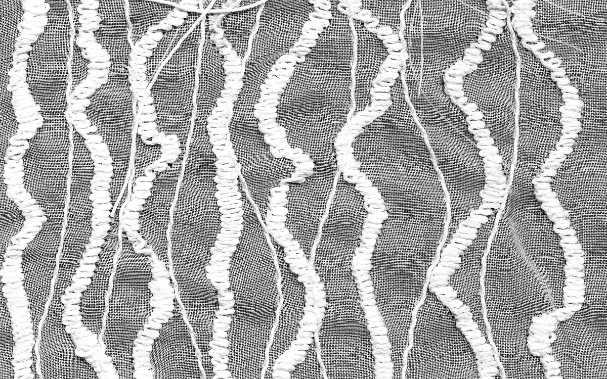
MATTHEW HARRIS is a graduate of the textile course at Goldsmith College and has been working with textiles since 2000.  During the previous ten years he made and exhibited drawings and works on paper.  He uses dyeing, cutting and hand stitching in his work.

Lantern Cloth III (detail)
Above is a detail from one of Mathew Harris' constructed cloths, one of a series of three and inspired by his experiences in Japan where he became interested in printed decorative motifs on kimonos.  There is a further link with Japan through the medium of oriental penmanship and elements of this make their appearance in his work. This piece was exhibited in 2007/8 as part of the Trace Elements body of work and executed in white, grey and black with a range of pink red tones.

Matthew Harris finds the construction of such pieces engrossing: detailed cutting, stitching and dyeing result in a complex arrangement of shapes of varying colours.  These include tones of a beige, ecru, putty spectrum.  Shades can be smudged and faded or brought into prominence, each patched in place with hand stitching showing the careful construction of the piece.  For this same exhibition Matthew Harris include Cartoons for Cloth in which he also used varnished paper which gave an off-white translucency akin to tracing paper.

In his work Matthew Harris aims " to create pieces that explore repetition, pattern and the disrupted or dissonant journey of line and image across and through the surface of cloth."


Health and Safety


Costing Materials and Recording Time


Date design work began : 09.08.12.               Completed approx : 17.05.13.          80 hours in total.
Date embroidered item was started : 01.06.13            Completed : 23.06.13.         30 hours in total.

And finally ....

It's a strange feeling to be coming to the end of a project, that longed-for yet undesired goal,  the moment when you confront the success or failure of your work.  I've been reminded that I am not alone in this when I started to reread the chapter on evaluation in "how to be better at .... creativity" by Geoffrey Petty.  This book was suggested to us in a workshop group at Urchfont by Janet Edmonds and there is much in it to be recommended, particularly the discussion about what sort of judge or evaluator you are. So, am I the 80%/20% critic whose positive comments by far outweigh the negative, the one I remember so much from my teaching days and so successfully encouraged the young to try again?  Or am I the 60%/40% kind an adult might have more trust in?  Here goes.


Collar in Silk Organza

On the whole I am pleased with the end result.  I feel it meets the remit of being functional, and three dimensional and embroidered.  Although I have been working on this project for a long time it still manages to capture that essence of  "fishiness" from the early Module 2 exercises.  This "fishiness" is apparent especially in its shape and construction.  And this is where spending a long time has had its advantages; it's enabled me  to develop ideas (the two types of fin and others), and respond and test out those given to me by Sian (one example is stuffing the insert fins).   Sian's nudges have helped me produce a piece more complex in structure than I would have done alone; my inclination would be for simplicity, but then this can be an excuse for not exploring further and finding better solutions to issues than arise.  Whilst there are ideas that I might not have reached myself there are those I had to relinquish.  The one I let go most reluctantly was having text on the collar.  When I tried the words were indecipherable, even an attempt using Trick Film to stabilise the organza left a crunchy deposit round the stitching when heat was applied.

Tonally, the piece is less successful.  Although I do like the randomness of the shibori the tones do not change from light at the collar's inside edge through to dark at the outer edge, as I imagined I might have been able to achieve.  The embroidery aims to emphasise lightness at that inner edge.  I applied three different threads: one variegated (blue-grey to white), one Gutermann's 111 (softer than white) and a thicker polyester thread, again in 111 and by Gutermann, to achieve this.  In an earlier trial I had added an even thicker crochet thread, but this was too thick and dominated the collar, not only because of its thickness but also because it was not available in off-white.  The stitch I chose for this embellishment was a double zigzag which became longer along the line's length.  Much finer stitching of the same sort was applied in fine dark petrol blue thread with a soft grey in the bobbin.  In choosing the double zigzag stitch I hope to give a sense of movement as well as replicating the collar's jagged edge.

The silk organza produces a light and elegant look exactly as I had hoped and as the original design portrays. The fabric takes dye beautifully and its translucent property means that even when layered or pleated it still appears light.  Its crispness means that it is possible to pleat and roll it successfully. Following Sian's suggestion I inserted tubes of Stitch and Tear in the top of the insert fins and then stuffed them with polyester wadding.  These tubes partially show when viewed close up.  Attempts to disguise them proved unsuccessful as an extra layer of dyed organza wrapped round them does a poor job of disguising the tube and adds to the bulk which needs to be stitched into the neck edge.

In spite of its many lovely qualities silk organza has one main failing as regards this project: too much handling results in the edges becoming frayed, a problem when seams need unpicking or the collar is attached to a garment.  I have fitted the collar to a v-necked cardigan, not my preferred solution which would have been a light tweed v-neck dress.  The cardigan has had the disadvantage of being stretchy whereas tweed fabric would have been more stable.  To finish the collar neck I finally applied inch wide grosgrain ribbon and this works.  My original plan was to cut a strip of silk organza on the cross, however this also was stretchy and impossible to make its length stable.  It also meant that the binding and fins both sat on top of the cardigan neckline.  Although at present the collar is simply tacked on the grosgrain ribbon is under the cardigan neckline and the collar as a result curls over the edge sitting above the neckline emphasising its three dimensional quality.  Tacking the collar on in this way may not be the final solution as handling the collar too much causes fraying.

Finish is such an important part of any item.  I've already talked about the problem of silk organza fraying, where I would also criticise the collar's finish is with regard to the embroidery.  At the end of every line of machine stitching I put the machine into reverse and then cut the thread close to.  Mostly this proved successful, however there are quite a number of loose threads remaining.  This could be viewed as complementing the collar's ragged edge:a matter of opinion.

Is it nice to wear? It's beautifully soft next to skin and it enhances the neckline well, though I think it will require quite an occasion to wear such a dramatic-looking piece!


Thursday 30 May 2013

A Tangent

 Do you ever feel a piece of work is complete and that you add stitching to it, on advice, but reluctantly?  So it is with this piece to which I have now added lines of zigzag and by adjusting the top tension created this slightly foxed effect,which is surprisingly effective.

1.  Piecing with over-stitching
 Sample 2 below shows the same piecing method using dyed and embroidered fabrics.  No stabilising fabric was used making the strips, which are cut on the cross, difficult to handle, possibly they too narrow.  When I placed something like Stitch and Tear or Vilene underneath the organza looses its translucency and therefore I decided against it.

2.  Organza Piecing.
Sample 3 below show Sample 2 over-stitched in the same way as Sample 1.  It was not possible to apply the same density of stitch at the beginning of each line as the organza becames bunched under the machine and the width of the strip is further reduced.  What is successful, however, is that the tones in each over-stitched strip are more graduated.  Whilst I found Sample 1 was improved by the process I don't think Sample 2 is; maybe more experimentation would help, but for now my decision is made and I think I need to proceed with the collar ideas in my previous post.
3.  Organza Piecing over-stitched.


Monday 27 May 2013

Homing In

The photographs below show the next design phase, both construction and decorative elements.


1.  Three versions of Fin Inserts showing different decorative stitching.

2.  Preferred Fin Insert (view 1).

3.  Preferred Fin Insert (view 2).
 The preferred Fin Insert is a fourth version of the fin.  On this version the stitching is a double zigzag set on the longest length.  The top tension is loose so that the white top thread pulls through the dark petrol blue thread on the lower bobbin.  On the outside the stitch is a clear irregular scribble.  While using the same stitch (and in the same direction) on all the fins I wanted to make the Insert Fins darker.

4.  Collar Construction showing Main and Insert Fins.

Image 4 shows the Main Fins cut 5" wide, wider than previously.  Their edges are double zigzagged in petrol blue and then stitched part way round the tube-shaped Insert Fin creating a rippling embroidered additional edge.  The tube shape is created by inserting a short roll of stitch-and-tear stitched invisibly in place.  Further stitching is applied to the Main Fins on soft grey, petrol and thicker white thread. Each line of machine embroidery is overstitch and close cut.
This construction curves well round the cardigan neck.  The tuck made on each Main Fin makes it easy to make small adjustments so that the Insert Fins match on each side and are positioned on the shoulder.  The two collar sections are finished with two bias cut strips of silk organza.
Whilst the collar pleases my eye and I'm particularly pleased with the way the Insert Fins are constructed the embroidery on the Main Fins may still need a richer treatment.


Roads not Taken


Amongst a number of ideas I've decided against pursuing are printing using fabric paints, and printing on organza using the fish images taken early on in the module.


1.  Printing on Organza

Printing with fabric paints on organza was a worthwhile exercise.  I discovered just how light a touch I needed to be successful, and the effect created when too much paint was applied.  I wrapped string round the roller to produce these sketchy marks; had I chosen to pursue the technique further I would have made some printing blocks. The marks on the piece above could have machine embroidery added.

2.  T-shirt Transfer

3.  Non-washable Organza
 The digital images produced with these two products are very clearly defined.  The t-shirt transfer, however, produces a thick matte coated surface which is too stiff for the collar, though stitching on it works surprisingly well.

I had expected the fish print to work well on the organza and I was not disappointed: the print is clear and the fabric's feel is soft.  However, it is much finer than the organza used in my other samples and has a blueish haze which does not look right when integrated with other organza pieces.(see Sample 4 below)

4.  Fibonacci Sample
I also set out to explore how I could use the Fibonacci Sequence thinking that I could apply it to the construction of the main fins.  Sample 4 above shows this with its bands in a 1, 2, 3 sequence.

5.  Fibonacci Sample


6.  Fibonacci Sample

Samples 5 and 6 show how much more effectively a design can work when the dyed and machine embroidery is orientated in the same direction.  On Sample 6 I used a dark petrol blue to machine waving loopy lines through the dark dyed surface linking it with the two other fabrics. Whilst tonally I like this piece it has become yet another of my discards:  the seams create bulk and a tension which I can only overcome by machining any tucks I make down thereby loosing the sense of loft I like.  Also, when dyed the organza has a slightly crinkled appearance, though attractive does not marry-up well with flatter pieces.

So if making Fibonacci Sequenced fins doesn't work, will applying the sequence to the width of each fin as it curves from centre front to centre back?  

7.  Collar Toile

 For Collar Toile 7 I used the sequence 1, 2, 3, 5, 8.  I also had to include the width of the fin insert after each main fin.  The resulting callico collar need quite large tucks to make it fit.  Even though it fits the back view on image Collar Toile 8 clearly illustrate a rather flat looking piece of fabric which is at odds with my intention.
8.  Collar Toile

I also tried out a 1, 1, 2, 3, 5 sequence and a 1, 1, 2, 3, 2, 1, 1 sequence (Collar Toile 9) and came to the conclusion that my original thought of making all the main fins the same width was probably most likely to be successful by allowing me to position the insert fins where I wanted them.  In other words I was creating an unnecessary straight jacket for myself.

9.  Collar Toile


Three Dimensional Shapes

The tall central shape and the bottom right fin shape are influenced by observing fish.  An further idea would be to cut the top plan of the tall shape at a more oblique angle.

A Selection of 3D Shapes.


Sunday 26 May 2013

Richly Stitching

Below are a range of samples showing some of my experiments with stitch and dye on white silk organza.  I've tried to respond to both the traces of dye on the fabric and patterning on fish skins and the way they pulse when at rest or dart and weave through the water.  As always some are more successful than others.


1.  White and Metallic on Black

2. White and Dark Petrol Waves

3.  White on White

4.  Soft -dye with Stitching

5.  Stitched and Dyed

6..  Dyed and Stitched


Wednesday 8 May 2013

Edging Forward

Having been away for a week it's good to get back to stitching.  In view of this break Sian suggested I look through my work so far and select what seems relevant to the collar design and put it together on a pin board.  She also asked me to say why I'd chosen the items.  I came up with a list of words which they all seem to demonstrate: movement, rhythms, pulses, and reflection and refraction.  They arouse this response even though the techniques are different.  I particularly like the interweaving of what are really quite simple lines of machine stitch, also the transitions achieved between one tone and another in the woven piece and the random connections that are made between marks.  I like the fabric piece below it too and wonder whether it is possible to create a more subtle effect when piecing the organza.  I realise yet again that I'm so keen make decisions about structure without sufficiently taking into consideration tonal distribution.

Pin Board

My mind does feel less crowded now, however, there still seem to be a multitude of creative decisions to make.  

It's also been helpful to trawl through Sian's advice over the months since I first uttered the word "collar". So here then is what I'm proposing to work on over the next few days.

Treatment of Background Fabric:
1)  Test out printing, using a very light touch.  String round the roller to make the wave patterns on the paper sample above.
2)  White on white embroidery, followed by light dyeing after folding the fabric on the diagonal both ways aiming to achieve scale-shapes..
3) Try out using my images by printing the fabric with my printer.  Would you please send instructions for this, Sian?

Construction and Tonal Distribution:
1)  Machine embroider the collar sections I've already made.
2)  Make fin-shaped inserts even wider and using the narrow to broader zigzag machining as on the pin board machine along each edge. This should make the machining on the fin-inserts at right angles to the fins linking them.
3)  Try out stitching tonal organza strips together to make the main fins, thinking about cutting them in Fibonacci Sequence proportions broadening as the collar moves round to the centre back.

Collar Details
I've tried to show here my current thinking about the collar construction, of course the dance between fabric and construction goes on and there may be many more amendments yet.

Friday 26 April 2013

Chapter 11: Further Design Exercises leading to Fabric Samples

The following samples show a number of ways of arranging different paper strips.

Sample 1
Sample 2
Sample 3
Sample 4
A selection of the boldest patterns showing gradations of tone.  In Sample 1 the darker tones are interspersed with lighter ones, whilst in Samples 2-4 the tones move from dark to lighter.

Sample 5
Above, in Sample 5, narrow dark strip with deeper bands of pale tones.
Below, in Sample 6, strips of a narrow range of tones

Sample 6

Sample 7