Sunday, 5 February 2017

Completion

Well, I've had my neck piece feedback and now it's time to complete it, which I'm really keen to do.

The final dilemma concerned threading the hematite beads on to the cord which caused the it to break. I inquired about the holes being made bigger and tried myself with a gimlet, but the stone is far too hard and the idea not recommended.   I do like the hematite beads and really want to use them, though I recognise their limitations: their scale is possibly a little too small and maybe they are almost too close in colour and texture.

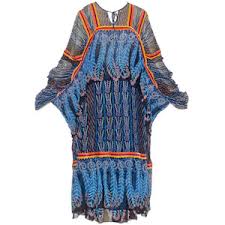
So what did I decide to do?  I've taken the whole thing apart, made several lengths of cord in case of disasters and decided to include some milled old bronze-brown glass beads as additional spacers. I've placed these where I had used the circular Tyvek beads in one of my trials. They add another layer of texture which emphasises the industrial  look I wanted to achieve.  They also allow the long Tyvek beads to splay out, as shown in the neckline of the evening jacket photographed below.  I think the combination works well.  The neck piece fastens with a further milled glass bead and a loop.


!0:10

Bead and Loop Fastening:

I threaded 10cm of the cord through a milled glass bead and twisted it five times.  I looped the cord in two and twisted it along its length.  To disguise the end I then spiralled the twisted cord in the direction of the bead.  The attachment is neat, secure and strong.  The loop is made in a similar fashion.

10:11

10:12


Tuesday, 24 January 2017

Chapter 10: Design an Accessory


It's an interesting process to review this module's work highlighting the creative path that will lead eventually to an accessory.  Part of this story is this image of a University of Anglia (UEA) spiral staircase: an upwardly curving column of concrete wrapped in a metal turquoise handrail.  Practical and elegant, its proportions appeal very much to my eye.


10: 1


A further link with UEA, and again on the same creative path, is the events progamme for Sainsbury Centre featuring "Standing Woman" by Alberto Giacometti, an artist whose work I have always admired.  I like the exaggeratedly long, lean proportions of the woman and her stillness.  The texture of the piece is attractive too, looking as it does as if the surface has been built up little by little.  It is cast in bronze which has a warm finish which is not a single colour, but an intermingling of tones.

A divergence here in my thinking about Giacometti and on to artists generally.  Like others I have spoken to, I don't always complete the chapters in a module in the order in which they appear.  In the excitement (and relief) of coming to the end of this module I decided I was in the mood for Chapter 12: Research Three Artists.  And what a revelation they have all been: their work ethic, their continual drive to develop and improve -- it's what I read about and value in Giacometti's work.  I am sure this lesson about the way artists work is one I have registered before, but this time it is sufficiently memorable to make me want to change the way I do things and so in Module 4 I'll be researching Cas Holmes and Lois Walpole at the beginning, leaving, of course, my own choice of artist to much later in the process.  It is not that I want to copy another's work or be overly influenced by them (though that may be for others to say), it is more about having a conversation with myself but using them as intermediaries.

To return then to Giacometti who Sian suggested I could use as inspiration for this piece.

10: 2

Below then, in images 10:3 and 10:4, are the next stepping stones on this particular creative path. Both show elongated structures wrapped in a number of expressive ways.  Originally I'd though they might be suitable as brooches and it may well be that that's what they become at some other time. I've already learned the Zandra Rhodes lesson about what a rich source sketchbooks can be a. For now though, my thinking is leading towards a neckpiece made of a number of elongated shapes, probably graduated and as in image 10: 5 made out of Tyvek.  Applying a heat gun to Tyvek is, as I've written before, a magical experience, though knowing when to stop is a finely balanced decision.


10: 3

10:4

10:5


Bead Making:  For the Giacometti beads I chose to combine two weights of Tyvek.  One is light weight, its surface is fibrous looking and the Old Brass Light Body Metallic Acrylic which I've chosen to use is difficult to apply.  This version of Tyvek simply absorbs the paint at the first touch, even the addition of water to the brush makes no difference.  The result is very uneven coverage, unless you want to use the whole pot. The slightly thicker weight of Tyvek is smooth and no such problems occur, though both sides do need painting.

I put pieces of both types of Tyvek together and rolled then tightly round a knitting needle, fastening it with two dressmaking pins until the heat has begun to take effect.

In order to try and graduate the beads I measured the Tyvek taking shrinkage into account.  Unlike my initial euphoric experiments this was a more painstaking proceedure with plenty of stop and go, in an attempt to give some uniformity to the beads beyond that of using the same materials and colours.

Then there was the question of winding thread around each bead and whether this added to the look, giving an extra element of texture, or whether it restrains the way the Tyvek melts and morphs into different shapes.

I decided to make a completely new set of beads, using a shorter piece of Tyvek and wrapping it round a thinner knitting needle (size 11).  Spiraling the Tyvel made for a very "produced" look that I didn't like.  I also decided not to use thread.  The set of beads I made in the end are organic looking, graduated and the right sort of mis-matched.  It does seem to be important to make them all in one sitting.

Threading: The beads need holes before they can be threaded.  When thinking this out I had considered putting a hole through the Tyvek before heating, leaving a thin metal rod in place during the heating process.  This isn't really practical.  My next thought was to use a small drill on the finished beads.   Having spoken to Alice Fox at the Harrogate Knitting and Stitching Show about this (she uses a drill on the shell brooches), she suggested that an awl or bradawl would work and this in fact was what I did.  No easy task as the heat gun can melt the Tyvek creating too arrow a waist at exactly the place I want to put the hole and these I did want to be evenly positioned.  It had also become clear in the bead-making process that each one had a top and slightly tapering bottom.

A further consideration at this point was the cord on which the beads would hang.  It needs strength without bulk, so I combined fine wire with very fine rayon (hand-dyed) and what I've taken to calling tiger thread, a brown and metallic combination made by Madeira.  It should be possible to get this combination through the eye of a medium needle and the double thickness will slide through the hole. If this isn't successful a Beadalon collapsible eye needle may well work.

Spacers: This subject hasn't been fully resolved yet, as it seems to be dependent on the personality of the neck piece.  However, spacers are necessary both for practical reasons as well as aesthetic ones.  Practically they give weight so that the piece hangs in the right place and they allow each bead to breathe; aesthetically they add a extra textural dimension. So this is where the neckpiece's personality comes in.  Is it a classic, quite stark looking piece of jewellery true to the Giacometti sculpture, or could it be pretty?

The length of the cord may also come into play here.  Should the neckpiece sit on the collar bones, or mid-chest, or nearly waist length?

What should I use as spacers?  They need to be in proportion to the Tyvek beads; they also need to compliment them in terms of colour and texture.  Although I've used metallic paints and they do have a gleaming quality I had hoped for, maybe the Tyvek beads look a little flat.


10: 6

10: 7

10: 8

Image 10: 6 shows amber coloured beads as spacers, image 10:7 shows the addition of gunmetal smaller beads either side of the amber bead.  Image 10: 8 shows the amber beads interspersed with Tyvek circles which have been head-treated, resulting in a lacy slightly distorted shape and finish -- an attempt at prettiness.  Neither is completely successful though  think a classic look is much more to my taste.

A Shopping Expedition  Yesterday  I went into Norwich on a bead hunt.  I did not have enough amber beads in my bead collection, so needed to replace or supplement those and perhaps look for another possibility.

Hobbycraft first, where I did find some amber beads, but unlike the ones a home, saved from some craft buy years ago, these were mass produced and without any colour variation.  I bought them, in case I found nothing better.

The next stop was Raphael Crafts, a wonderful store of beading treasures.  There I found the perfect thing -- hematite discs in two sizes, a gorgeous bronze-brown.  The material is just right and complemented the Tyvek beads.

Making up.

10: 9


Today was making up day, exciting as I thought I had everything ready to go, and yes, I am pleased with the result but there were trials along the way and there are some problems still to overcome.

The piece has rhythm and that is what delights me most.  It's as if my beads and the hematite ones are speaking the same language, though there is a downside to using them -- anyone with a pacemaker should not wear them as they are magnetic.

A Downside and a Dilemma 

The main downside has been using my lovely cord.  I was able to make good sized holes in the Tyvek beads with a fine awl from Hobbycraft therefore an ordinary needle worked well.  In order to pull the cord through the hematite beads, particularly the small ones, I needed to use the collapsible eye needles.  The metallic tiger thread became caught up and sometimes broke as the threading process continued.  I threaded the beads from both ends thinking the cord would be less worn in the process, however,  little by little I had to cut pieces off the cord and even though I had made a metre long piece, it's now less than half that length.

The shortness of the cord leaves me with a dilemma.  I can leave the cord short (that is suitable for a collar length neckpiece) and make a bead and loop fastening with what cord is available.  I could try to attach an additional piece of cord either side using beads as a disguise.  This may be attractive and echo the rhythm of the piece, but I don't think it would be strong. Alternatively I could start again and thread the beads on a fresh piece of cord, being very conscious only to thread each bead once so that it is less likely to become snagged or frayed.

Monday, 9 January 2017

Chapter 12 : Research Three Artists


Zandra Rhodes

There are so many things to admire about and learn from Zandra Rhodes, her practice and designs. She is enormously hard-working and committed.  She transformed her love of colour and pattern into clothing designs which have become successful in the world of international high fashion.Through her teaching and later her Digital Study Collection she has made her knowledge and understanding of garment making available to those keen to learn from her expertise.


Zandra Rhodes was born in Chatham in Kent in 1940, during the Second World War.  She was introduced to the world of fashion by her mother who was a fitter for the Paris fashion House of Worth.  Zandra Rhodes trained as a textile designer, studying first at Medway College of Art in Kent, later at The Royal College of Art in London.  Her early textile designs were considered to be too outrageous to traditional British manufacturers so she decided to make dresses from her own fabrics.  She pioneered the untapped potential of printed patterns to accentuate and define the silhouette of garments.  She opened The Fulham Road Clothes Shop in 1967 with Sylvia Ayton setting up on her own and taking her collection to New York two years later.  American Vogue featured her garments and she began selling in New York and Britain winning Designer of the Year in 1972 and Royal Designer for Industry in 1974.  Throughout the 1970s and 1980s "her fashion shows were one of the highlights of London's fashion week.


In 2003 Zandra Rhodes opened the Fashion and Textile Museum in Bermondsey Street to to promote British design talent.  Her career has spanned over fifty years.  She was made a Dame in 2015.
What is it then I've learned from Zandra Rhodes?  The first thing is where she looks for inspiration: she talks about inspiration being "things at hand", whether it's a collection of buttons or the tulips in a vase on her table, or those she finds when travelling: a skyline in New York, a field of lilies in Japan, or a trip to Ayers Rock in Australia.

Zandra Rhodes: 1


Zandra Rhodes: 2


It is Zandra Rhodes' sketches which are her leaping off point.  She comments too that it's important not to throw any sketch away, even when it doesn't work out well, but to live with the mistakes and learn from them.  She also uses photographs to support her sketches.Her accumulation of sketchbooks is vast: a great archive of material which can inspire again and again.

Ideas are not necessarily used only once.  Zandra Rhodes talks about the cross fertilisation of ideas, how a sketchbook note or drawing can link with another elsewhere, or be sought out when it connects with a new observation or experience.  A good example of this is her re-use of the feather motif.

Zandra Rhodes: 3

Image 3 also illustrates how some of her fabric designs broke with convention.  Rather than an allover pattern covering the length of a piece of cloth her fabric design might  marry several interrelated patterns inspired by her research, patterns which differ in any number of ways, such as scale or density or tone. Some of her prints are designed on a quarter circle. This method of designing requires a wholly different approach to garment making and enables her complex designs to be used to best effect to enhance the body shape.

Zandra Rhodes is noted for her use of colour.  Take a look at its vibrancy in these two colour versions of her feather fabric: one softer hued, the other eye-poppingly vivid, both equally successful.


Zandra Rhodes: 4

Zandra Rhodes: 5

Colour is important too in the early phases of printing a new Zandra Rhodes fabric.  After the background colour is chosen work is carried out by the screen printer to check the proportions of the printed colours  used to ensure that they not only work together but also with the background.  

Further attention to detail can be found in the finish of garments such as the complex use of techniques in image 6.  Pleated frills may have a zigzag edge giving a colour accent picked up from elsewhere in the garment.  Other hems are finished by enclosing fishing line in the rolled hem.  This creates movement and drama.


Zandra Rhodes: 6


The drama of Zandra Rhodes' designs comes from an experimental approach to her work, an inclination that rules nothing out.  For example her treatment of the seams in the Dinosaur Coat, a design feature which she again uses down the front of the coat.  


Zandra Rhodes: 7

Embellishments too are part of the Zandra Rhodes' story.  The embroidered flowers on the Dragon Coat create a colour accent. whilst other garments may be lightly beaded along an edge or densely sequinned and beaded as in image 8.

Zandra Rhodes: 8
Seeing the drama created in Zandra Rhodes' designs it is not surprising that her career has turned towards the theatre where she has designed costumes and sets for operas.  Nor has she allowed her ideas to become stale, as in this punk-inspired evening dress below. 


Zandra Rhodes: 9


Zandra Rhodes has a strong business sense; her catwalk shows are innovative and crowd pleasing and she is will abandon a range (such as the one in denim) when it proves too labour intensive to be commercially viable.  She has talked about needing space to find inspiration for her work and the need to feel conviction in her designs.  In an interview she commented that if you were looking at someone else's clothes and thinking they were better than your own you were not answering your own questions.


Deidre Hawken


Deidre Hawken 

Deidre Hawken is a designer maker specialising in couture millinery headpieces.  Originally she trained as a stage designer at Central School of Art and Design, later in 1998 QEST awarded her a scholarship to study couture millinery.  Her work is exhibited and sold widely, both here and abroad.  Her work is also held in many permanent collections in such places as the Victoria and Albert, the Kyoto Costume Institute and The Metropolitan Arts Museum in New York .  She is a Fellow of the Society of Designer Craftsmen and a Fellow of the Royal Society of Arts.  She has also worked for the Royal Opera House and Ballet as well as film and television.

Broad Bean Hat


The Broad Bean Hat is part of a V&A Permanent Collection.  The museum's website gives a really clear idea of the materials and techniques Deidre Hawken uses.  The headpiece has a blocked canvas base covered in dyed silk organza, the edges wired and bound in the same fabric.  The assorted salads are cut to pattern using dyed silk taffeta and silk velvet some of which are wired.  To create the lettuce leaves' crinkled effect the dyed silk organza was scrunched into a tight ball, tied with string and left to dry. The pecorino shavings were made from dyed silk taffeta and organza; the peas and beans from epoxy resin which was handpainted and attached to wire; the pea shoots were created from pieces of wire covered in florists tape.  All of the components were handsewn to the base.

To finish the headpiece was lined in dyed silk taffeta.  It was designed to be worn on the side of the head and has an integral hair comb inside to keep it on the head.

It would be really interesting to have some insight into the early creative processes of headpiece design -- the inspiration material, the drawing and experimentation that happen to ensure that the materials and texture reflect the salads and vegetables Deidre Hawken is trying to recreate.  Of course there are very particular considerations when making a  headpiece: its weight, size and shape and whether it will be in proportion to the wearer. These factors will also affect the way in which the headpiece is attached to the head and the way in which it can be worn.  The balance between aesthetics and practicalities is always in the mind of a designer-maker especially when the designs are also aiming to create drama and impact.

Nasturtium Hat


So where do Deirdre Hawken's ideas come from?  Her work is described as delicate and whimsical. Flowers as an adornment for a headpiece are unsurprising, fruit and vegetables have been tried before though not in this way, but patisserie, is attention grabbing, intriguing and thought provoking to say nothing of a tin of tuna.

Deidre Hawken

 It is suggested that Deidre Hawken's current work explores the often ambiguous relationship women have with food, and that her ideas are influenced by Surrealism.  Her work is curiously beautiful and inventive not only drawing admiration for those exciting qualities but also for its exquisite craftsmanship.


Shuna Rendel


Beauty is found in many forms and created from many different materials.  Shuna Rendel's art works are beautiful and strong with the power to draw the viewer in and captivate them, sensing some of the tension and excitement inherent in their making.


Shuna Rendel trained as a  a sculptor and her work is informed by research, analysis, experiment and manipulation using basketry and textile techniques from all over the world.  Disciplines as diverse as architecture and textiles provide the context for her creation of stable forms from flexible materials. She holds a large collection of baskets from all over the world.  These have been made using a variety of techniques such as weaving, coiling, netting, linking, looping and lashing and she uses them for research and analysis. 


Shuna Rendel's three dimensional flexible sculptures use natural materials and traditional techniques.  Her manipulation of forms challenges materials and their natural qualities.  She takes a simple line and form and gives it life by exploiting the materials' flexibility by twisting, pulling, turning and stretching.  Her research and sampling ensures the appropriate choice of materials and technique so that she creates a manipulated material light or dense enough to convey the continual pounding of the sea on stones or the protective encasing ribs give vital organs.


Break, break,  break on thy cold gray stones, O Sea

Ribbed Form


"Break, break, break on thy cold grey stones, O Sea" and "Ribbed Form" illustrate the challenge of creating such structures from the natural materials Shuna Rendel favours.  She describes the act of creation as "drawing in space" and when successful she overcomes the flexibility of the material's natural movement and harnesses it to make forms which  reveal movement of line within the surface structure of the piece.  "Each piece is a a search for that essential tension between flexibility and fracture, stability and collapse."


Dark Form

In the making of Dark Form Shuna Rendel combines the use of wire with natural materials such as hemp and chair cane, both of which have been dyed.  The harmonious tonal range she uses ensures that the eye is drawn to the rhythms and movement within the piece and looking at Shuna Rendell's work has helped me to understand more clearly these aspects of design and making.


Monday, 22 August 2016

Slashing and Rhythms


Yet another thought I brought along to discuss with Sian was the idea of slashing.  The ground of my piece is made up of four layers: a piece of dark grey silk, a silver metallic cloth, bronze-grey shot silk and the top layer silk organza.  In stitching narrow parallel lines of varying length and slashing through the three top layers I thought the surface could be further enriched, bringing toning colours and rough texture to it.

1.1 Close-up


1.2 Close-up


1.3  Still Small Voice of Calm


1.4  Left Edge Detail
1.5 Right Edge Detail


Sian talked to me about using a rhythm to apply the cords and this I have tried to do, and with the slashing and later with the application of fine stitching and beads.  Hopefully all the techniques are fully integrated and look right.

Here then are views of the finished piece, though it may be a little premature to say so.


Mounting Resolved Sample

I mounted this resolved sample soon after I completed the piece in August. Sian and I had discussed cropping it at Summer School and as you can see from Image 1:3 in my last post I adopted the idea.
I took a thick and textured piece of rag paper, measuring 55cm x 44cm giving a lovely wide surrounding area to show off the textile piece. I cut two carefully measured slits and positioned the piece along the tacked lines I'd marked when working on it, taking them out afterwards, of course. I then used acid free tape to position it, only at the top so that it is supported: it is exactly the same approach I use with my photographs. As you can see the result gives two horizontal clean edges and two curved and softly layered vertical edges. I think it works.

Cords

So I have confirmed the ideas about the ground for this piece it's time to work out how best to apply the cords and threads.

Before the summer school I had made a selection of fine cords in my colour scheme and in her feedback Sian had suggested grouping them together then applying them, but how to achieve this.

In the back of my mind was  a television programme, part of a series made by Dr. Jago Cooper, exploring ancient civilizations (something I find endlessly fascinating) of South America.  What was appearing through the fog in my mind were knotted cords made by the Inca.  They were arranged in various lengths, knotted along their length and tried to a base cord.  In the image below they almost look as if they might be a collar.  On investigating further the knots turned out to be formed by twisting and knotting the cord in three different ways.

Even more exciting than the look of this artefact was its purpose.  My preferred explanation for its creation was as a story-telling device, a holder of history and memory.  Another explanation is as an abacus or some way of keeping accounts, but that's not really to my taste, though I can see how that idea sprang to mind.

1.1 Inca Quipa Knots
1.2 Forming Quipa Knots


Possibilities and Making Decisions

And what a lots of possibilities there are and so many as a result of Summer School and the opportunity to discuss this work so far with Sian and where I might take it next.

Alone in my workroom the possibilities juggle one with another: if I take this decision, then that may be the result, on and on in a never ending range of combinations.  If you don't actually sample those combinations there is no way of seeing how each one works -- no compare and contrast -- no making a choice of what works best.

When Sian initially told me she thought I wasn't particularly good at making decisions I wasn't completely accepting of the idea.  Now I've had some time to digest the thought, I've decided she may well be right.  So here then is the ebb and flow of sampling and deciding how my resolved sample should look.

At my tutorial we discussed the smaller complex circle, based on the paper-cuts, and whether it had a place at all as part of the design.  Though the colours of this element were in my colour scheme it did jump out as possibly too strong both in colour and texture: it was made of cotton and felt rather than silk and organza, and unlike those I'd dyed neither of them myself.  (Interestingly having too broad a colour scheme was the same error I made at Summer School with Flint Brocade.)  The way I had tried to integrate the two circles work was by adding fine springs made of cords and clustering beads around them, but it wasn't sufficiently successful to continue along that path.  Instead Sian and I talked about cutting into the main circle to reveal the shot silk beneath; this toned much better, but felt rather an extreme action to take.

My next thought was, if I'm going to cut into my piece of work do I need a minor circle at all?  I did,with just the knotted cords across somehow the piece seemed to lack any purpose, so to me the minor circle was a must.

Orientation was also a discussion point and we decided not only to turn the piece, but also to crop it.


Sample 1: Starting Point

Sample 2 : No circle at all

Back home and with so much in a state of flux, I sampled different size minor circles: smaller or even smaller and came to the conclusion that the proportions of the original size were in fact just right.


Sample 3 : Smaller Circle

Sample 4: Smallest Circle

Sample 5 : Just right

  And still resistant to the idea of cutting through the lovely top circle of carefully dyed, printed and pieced organza I began to explore other possible treatments of my perfectly sized circle, trying printing, trapunto, and printing and trapunto combined.  Finally I recreated a circle, like the felt and cotton one but only in shot silk, gradually cutting into it until it needed reconstructing and supporting on another circle resembling by this point a skeleton.  This was  a wholly unnerving experience.


Sample 6 : Printed

Sample 7 : Printing with Trapunto

Sample 8 : Deconstructed and Reconstructed

Wednesday, 13 July 2016

Flint Brocade

Here I am at home trying to make something of the samples I started and tried not to finish while I was away, wanting to work on them in a more considered way and becoming even more emotionally engaged with some of the pieces.

I'll start then with the solufleece challenge and try to work out what I've learned through the process.


Flint Design Stage 1

So here is the piece when I finished Summer School.  I've used the threads in the colours and textures I had available, quite proud of myself for getting on with the job rather than prevaricating too much.  When packing my threads I recalled the restrained palette of those travelling from abroad and tried to emulate it -- just bringing the colours that would match my images with an eye to their texture too.  As you can see I changed my mind when I got home.


Flint Design Stage 2

When I used the grey-brown Herdwick wool Jean had said, "You've nearly got away with it."  She was right, I hadn't, and in spite of the lovely couching and wrapping the first thing I did was to rip it out and replace it with a taupe colour.  It's tonally more in keeping, though texturally perhaps not so good.  If I were doing this piece again I would go still more shades paler.  And here's the thing, I used flint walls as the jumping off point for my Foundation Module and had a range of threads and colour sampling there at my finger tips in the lovely little book I made.  Another lesson learnt: don't forget to refer to your archive you probably have been through these thought processes before.


Flint Design Stage 3

So here we are very, very many layers of sorbello stitch on -- what a wonderful addition to my stitch repertoire.  I've used a huge range of muted threads to create a connective web between the rows of flints.

Flint Stage Stage 4: Flint Brocade (4"x 3")

 The final image shows the piece after washing and drying.  It's hard to put into words quite what I think.  The fact that I'm not enthusing tells me there's a mismatch between the expectation of Stage 3 and the reality of Stage 4.  Being new to this technique I find myself wondering whether the choice of visual reference was appropriate or is it the way I carried out the task?

Could the way the piece looks be the result of how it was washed out?  The water was only luke warm when I washed the piece, but the fibres do seem to have shrunk tightening the lovely lacy sorbello bands and flattening the piece's depth and the threads with sheen have become matte.  Maybe it's a case of less is more and next time the stitches should be less dense.

For the most part I'm pleased with the thread colours, though the blue-grey variegated thread seems more prominent than I would like them to be.

Next steps: perhaps a little more sorbello stitch in fine threads to recreate some of that cobwebby effect I so like.  And perhaps another go.  I saw this wonderful concrete wall yesterday . . . complete with ribs of rough-cut stone mixed into the mortar -- Concrete Brocade, now there's a thought!