After receiving Sian's feedback and reading the useful comments posted on my blog, I made a list of ideas to follow up. As the design was developed and refined some were incorporated, others discarded.
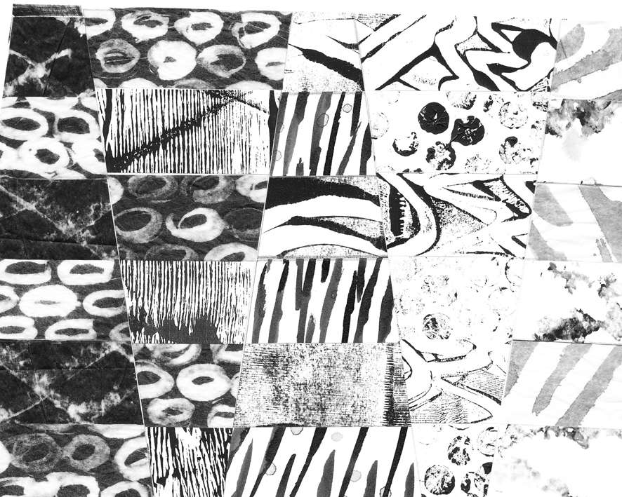
I started by dyeing the silk organza. The left side of the image is wet folded organza, the right a machine grid gathered up, both then have black dye applied.
 |
| Sample 1: light and darker Shibori on Silk Organza |
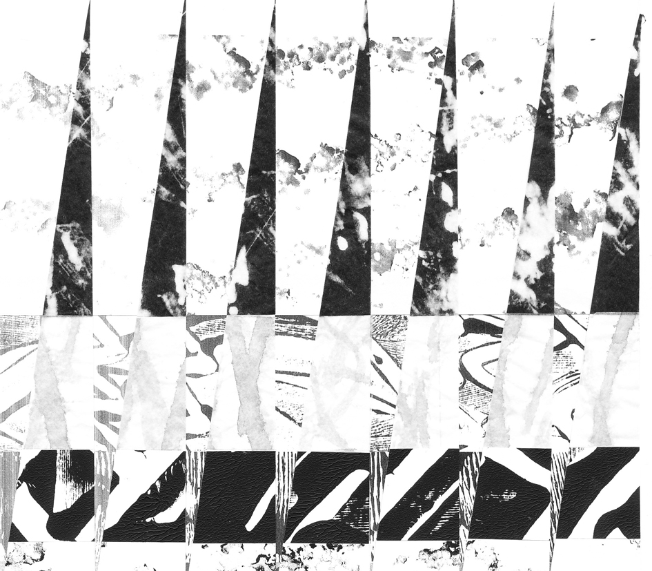
Both sides in this image show the largest fin shape cut and joined with a tuck half-way along the inside edge. Already I could see that the fabric and Shibori designs might preclude some of the ideas on my list, for example machine embroidery along the seams -- too busy!
 |
| Sample 2 : Inserts and Invisible Thread Seaming |
When the paper design was translated into fabric it seemed to lose its sculptural quality. I therefore decided to insert a narrow fin between two wide ones, which brought back a sense of depth and movement especially when it was overlapped at the neck edge. The extra seams increased the surface texture.
Thinking further about overlapping the narrow fin at the neck edge: should this be a seam turned in on itself and secured by a couple of stitches just at the top?
 |
| Sample 3 : Embroidery along Tuck and Edge Detail |
I used invisible thread so that there is no distraction from the Shibori lines. This was successful. Stitch backwards towards the outside edge holding the threads to secure, then complete the seam and cut the thread. This will be hidden in the binding.
The seam edges are a concern: handling can make the fabric fray which might be attractive if it could be done in some intended way. Sadly, being a natural fabric it's not possible to treat the edge and leave it sharp. I will need to cut the shapes very cleanly and handle them as little as possible if I'm going for this option.
I also tried to fix the tuck with embroidered words, far from successful -- the words are too bold and illegible. They are also too long and as a result flatten the collar out again. Perhaps sticking to an un-decorated tuck is best, or try a dart.
A further thought I had was to embroider parts of the fins with Blackwork. I liked the idea of making a design based on small diamonds which gradually disintegrate. After some experiments with different thicknesses of thread I came to the conclusion that the Shibori was creating that effect already. Blackwork relies on precision and it was not possible to achieve this, even though I had marked the needle insertion points on the organza. The embroidered lines didn't always coincide or work in parallel with the Shibori lines, and rather than one enhance the other they seemed at odds.
So where have I got to? Certainly a conclusion that less is more. The dyed fabric is interesting enough without further embellishment and works well the way the collar is constructed.
I have done a little market research amongst friends and the conclusion seems to be that the darker collar works best on the black cardigan. Though it has to be said I am tempted by the thought of making printed frayed-edge labels by putting organza through the printer and stitching one of these inside and along the length of the narrow fin, but this would only work in the lighter collar.
The problem of how the collar will finish at the centre front? -- a narrow fin on each side, overlapped at the top.
I'm also clear about how many fins I need to make the complete collar, and have the fabric dyed and ready.