Monday, 24 August 2020

Chapter 8: Borders

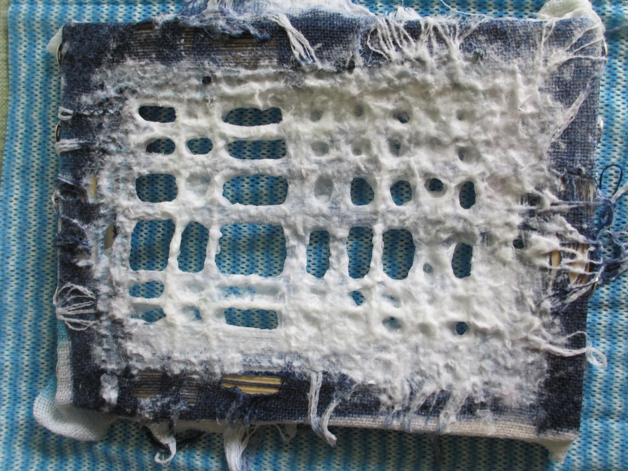
 I made up the paper pulp vat again using the cat litter tray which is good for making part sheets with my small deckle.  The paper sheets adhered best to the pieces with embedded threads, less well to the drawn thread pieces.  This in spite of putting all the sheets in my press.  As you'll see below this was not entirely wise: the drawn thread sheets were, of course, pressed all over squashing the paper pulp which had pushed its way through the holes and removed those lovely dramatic shadows -- a hard lesson!  Of course you have to be very careful when reapplying pulp, water travels a surprising distance wetting unintended areas.

The right coloured thread was something else I needed to consider.  From stock I found some nice linen thread and then from The Handweavers Studio I ordered some paper yarns and one made from abaca.  All have a lovely degree of "spring", or "memory" as the helpful girl at HS called it, this quality would work best with the lettering I wanted to embroider.  All these threads I then dyed using my blue recipe.


4:8:11


A final preparation was looking out my spray glue, only to find it had degraded and I had to throw it away.  As shopping in person is now something I hardly do I've ordered a replacement on line and it will magically appear tomorrow.


4:8:12

A little more warming up with charcoal.  I like a number of things about these results: the angularity of the letter forms, the thicks and thins, the light and dark, all achieved by a change in hand-pressure.  Printing, rather than embroidery might achieve this effect, but I'm not doing that, I'm embroidering . . .


4:8:13


4:8:14


I've used temporary spray adhesive and stitched in to 4:7:4, the piece which had become squashed when I pressed the border and sadly removed that 3D quality.  The hand stitching is in linen thread: its colour and spring give it just the right kind of prominence.  Much less successful are the paper letters spelling TIDES, also mounted on muslin.  When the letters were white they hardly showed so I coloured them blue, but they still remained too well camouflaged so that wasn't successful either. For the stitches on the letters I chose the finer silk thread used in the machine stitching.  The stitches are a little repetitive and restrained until I reached the "S", where they more closely resemble the linen stitches and that works better.  

Below is the final version of this piece and really a return to my starting point -- simplest is best!  In this image the lighting is right.


4:8:15


What is a great success is the silk piece 4:7:11!  My first thought was to weave upright sticks through it, then decided paper strips with poetry on them ("Sea Fever" by John Masefield") would be better.  Better still might be lines from a gansey knitting pattern and I may well make that change.  Much fiddling about with font and font size and the width of the strips, but these I think are just right.  It would be lovely to use my own handmade paper which would be a less stark colour, though I'm not sure my printer would like it. Or, I could machine stitch the words onto my paper.  The paper could also be used as a mount.

As I guessed in an earlier post, too much handling does soften the work.  


4:8:16


Lastly, in this group, a piece of some purity though this too has undergone some experimentation. I tried using some of the removed threads from the other dyed pieces, but even the softest tones were too strong: wrapping threads, of course, intensifies the colour.  So in the end the needle weaving is white on white.

My intention here was to create some half and whole lines achieving intersections randomly.  In doing so I hoped the tension of the stitching would develop angular holes, which has happened to some degree.  Is it possible to achieve the effect I'm describing?

The replacement border is much better.  Learning from a previous mistake I pressed only the border this time so that the drawn thread work wasn't crushed.  So much needs to be planned in advance and I think I made a wrong call in leaving the withdrawn threads rumpled along two sides. Withdrawing the threads in two directions would have been better, evening out the bulk, and probably covering them completely with the frame yet another better step.  I stitched into the border extending the needle woven lines diagonally and liked that effect, shown in 4:8:15.   A further thought: without the paper border I might have woven clumps of threads  into the surrounding linen something I'd tried in 4:6:9 and liked very much, though the threads there were variegated but with white on white the impact might not have been as great.


4:8:17


4:8:18


4:8:19


It's interesting how some ideas become part of a personal repertoire.  Here is a small section of my resolved sample from Module 1.  Extended lines stitched into the border.  To me it is a very attractive way of pulling a piece of stitching together.  Of course embossed lines on the border might be another nice idea.

Saturday, 22 August 2020

Chapter 8 : Stitchery into Paper

 I'm almost spoilt for choice, but have decided to start stitching on the two wire frame samples.  

First what looks like a cratered moon surface, pock-marked and with random holes scattered over the surface but with a concentrated area in the bottom left.  I used the space dyed linen thread drawn from another piece and looped it over the surface.  The thread is really too fine to make much impact and when taken from the frame the piece is very fragile, particularly where the stitching is concentrated making me think that a thicker thread though more visible would probably be impractical.

4:8:1

4:8:2

In another session and with much smaller frames (5 x 7 cm) I dipped netting in pulp.  The frames took such an age to dry, weather conditions I think, that they have begun to rust.  Another attractive addition?These samples don't quite have the variety of surface in spite of using the same plastic netting.

Why such small samples you might ask.  Well, I had a notion that I might join a number of them together in rows and columns to make a bigger piece.


4:8:3

4:8:4


And now off the frame and looped with paper tape on the left and abaca yarn on the right.  Except along the edges these pieces are surprisingly resilient.


Altogether stronger is the wrapped and knotted string sample.  Again I stitched this on the frame.  By way of preparation, a sort of warm-up exercise, I went back to my source material and first with charcoal made marks imitating aspects of letters.  I then cut short lengths of thickish yarn to mimic components of the printed letters in 4:2:19.  I sprinkled the yarn along the two left to right horizontals.  This was an attempt to break away from too literally copying the source material and also getting away from being too neat and careful with my stitching.  I photographed the results and with that image on the computer screen used it as a stitching guide.  It strikes me that stitching into paper pulp is a one attempt only affair.                                                                                


4:8:5

4:8:6


4:8:7


4:8:8

Again, a smaller unstitched version of the same technique and taken off the frame.  I'm surprised with the string samples just how fixed the shape becomes with so little paper pulp.


Then finally below are two further paper pulp experiments.  The first  is linen selvedge wrapped round the larger frame. Not much paper pulp adheres to the linen, but the fabric is stiffened by it.  The second, is my favourite,  a more successful version of 4:8:5.  I won't cut it off the frame but will try to ease it off in tact.  I have an idea that I can slide it over the front of a board book cover which has been printed and embroidered.  This string version will add another layer to the book cover and complete the design.  The knots look really good and they definitely have room to breathe.


4:8:9


4:8:10


Saturday, 25 July 2020

Chapter 7: Return to Paper Making

And very happily so.  I find real pleasure in the making of paper pulp, moving the deckle through the water, a shake, flip it over . . . familiarity in the process has returned.

Sessions 1 and 2
Below in 4:7:1 is my first attempt at applying a sheet of freshly made paper to a piece of drawn thread work.  When partially dry I split this by tearing through the middle and folding it back.  Later, as shown in 4:7:2, I applied several partial sheets along the sides, overlapping them and piecing the shape into a rectangle.  The piecing though didn't work particularly well as I omitted to press the surround as it dried.  Maybe spraying it lightly with water and now pressing it would work?


4:7:1


4:7:2


White pulp and white drawn thread work make for a very subtle effect. The preparation for smocking is what most immediately springs to mind and very subtley coloured threads will be needed so that the piece is not overwhelmed.  Careful handling too as the piece is fragile.

After dipping several other smaller, softly coloured pieces in the vat I moved onto a piece which is a great contrast in colour and boldness and had already been partially machine stitched. Silk pins were used to attach the fabric to the frame, such a helpful tip and I found them in stock! Below the front and reverse are shown.  Stitching on this piece will need a very different approach to the sample above.


4:7:3


4:7:4


The final example from this dipping session I want to comment on is below (4:7:5).  I had several attempts at laying threads on freshly made pieces of paper.  Initially the threads didn't adhere, but by putting a jay cloth and weight on the top I had more success.  As a piece to stitch this gives fewer hints.


4:7:5


Session 3

More dyeing, first using Jeans and China Blue, both knocked back as usual, this time with some Antique Grey rather than Black.  When I saw the results after washing out I felt I'd been too heavy handed with the Antique Grey in combination with the China Blue as the result was rather dull.

I also added some different fabrics into the mix: scrim and by way of a complete contrast a heavy silk mesh.  Both of these took the dark dye well.  I then went on to draw threads giving the paper pulp interesting places to cling.  As I saw the effect adding pulp had on each piece I've also been thinking ahead to Chapter 8 and considering  how and what sort of stitching could be added.


4:7:6


4:7:7

4:7:8


Images 4:7:7 and 4:7:8 show the front and back of the scrim as I scooped it through the paper vat.  I did feel rather sad that my dyed composition seemed to be lost in the process!


4:7:9

4:7:10


4:7:11


After the silk became thoroughly wet an the dyeing process it was easy to see the fabric structure.  I was also able to remove threads and generally distort the fabric.  I really loved the weathered and worn effect produced and even more so after the application of paper pulp.  The piece became a stiffened curved form and individual threads had developed a wiry quality, twisting in various ways.  I'm not really sure how stitching will enhance this.  Even though I'll keep the piece on its frame if and when I stitch it it will probably soften, losing its form and substance.


The two images below (4:7:12 and 4:7:13) show five inch square wire frames wrapped with three thicknesses of string knotted together.  As in the silk sample the pulp coated the knot tails, stiffened them and gave them a 3D quality.


4:7:12


4:7:13


Knots: 
Both in sample 4:7:12 and 4:6:11 I used knots: to tie lengths of string together or to finish a length of embroidery thread.  I do like knots: long tails going off in different directions, the twists and turns made in their formation and their general untidiness which adds texture.  It's interesting too to see how the pulp clings to them. Perhaps this is an idea I can work with when it comes to edges.


The three images below show fine white netting stretched and tied on to a wire frame.  The netting is very fine and it's surprising just how much pulp it supports.  It's interesting to see that sense of directionality in the way the holes are very obvious in the bottom left hand corner of 4:7:15 (the reverse) becoming more random towards the top right hand corner.  Hopefully my stitching can exploit that.

4:7:14
4:7:15

4:7:16


:
Using Coloured Pulp

The final three images show some experimentation with coloured pulp.  I wouldn't say that it was a very successful session.  The blue I made with some beautiful paper bags, contrasted too much with the white and I probably need to do some pulp mixing to tone it down.  Though, of course, stitching could also solve the problem. The piece also needs pressing for longer to embed the layers and make it more stable for further work.

I've learned a number of other things.  By using a shallow pulp vat (in this case a cat litter tray) it is easy to make partial and quite thin sheets of paper, but what I did find difficult was scooping up paper pulp with my hands and trying to apply it either on top of existing paper or to cover small gaps.  The effect was reminiscent of applying putty!


4:7:17

4:7:18

4:7:19


Furthermore


Above is Linda Green's graphic piece in black and white.  It is the variation in the density of circles I particularly like, that and the scribbly nature of those circles.  I think they may well have been made from wire suspended from pins, but I haven't been able to discover whether it is the case.


Sian suggested I use the linen thread in 4:6:6 and loop it over and through a grid in both directions.  It does, in fact, look very much more interesting than this image shows.  I realise my experiment is just that and it certainly brings home to me how very clearly thought through a design needs to be for it to be successful.  The techniques, materials and colour must all serve the purpose of the design.  


Friday, 10 July 2020

Dialogue: Feedback and Response

The last paragraph of Sian's really useful feedback suggested I refer again to my research and by examining and looking from every angle at the Drawn Thread Work of Chapter 6 notice links.  This, she thought, would also be a way to prepare for the next phase of work where grids and paper come together and, later on to more stitching.  It's such a good idea and so here's that conversation.


First of all I considered the things which drew me to my collection of images: a strong sense of movement and direction was one thing, especially in the calligraphy examples largely taken from "Calligraphy: a book of Contemporary Inspiration" by Denise Lach.  The samples consist of strong repetitive marks with some small variation created by the push and pull of the tool used, brush, ink pen or fibre tip.  Each of these examples consists of many rows, each row being filled by a range of broadly similar marks. 


 In image 1 there are bold but fading thicks and thins.

In Image 2 there are densities of marks akin to words but without the spaces.

The work in Image 3 uses a narrower tool and its density is alleviated by loops at intervals enclosing space.

The marks in these three examples are not only dense but complex too. The rhythm is staccato, abruptly disconnected and angular.


The maker's hand is evident and insistent in all these three pieces, wanting to communicate even though the language is unknown.


After much twisting, turning and flipping over here is a tiny fragment from a piece of Russian Drawn Threadwork which relates most closely to the examples above.  It's the reverse side of the piece and I think shows the angularity and staccato rhythm I've described.  I'm trying to imagine it stitched en masse.


Alice Fox's piece is also rhythmic, but has a more reflective quality.  To me it's about absence, rather than presence, what remains.  It links in my mind with the band of printed lines on old envelopes which I talked about in Chapter 1 and  resonances of the letter writers.  


There are I think associations between this crop of 4:6:12 and Alice Fox's piece.  There are repetitions, without each mark being identical.  There are also a range of tones, space and lightness which give a sense of the ephemeral.

Saturday, 4 July 2020

Combining Hand and Machine Stitching 2

For this final piece of drawn thread work I mixed some newly bought dye and as a result the colour blue is stronger, though many of the blue threads I used are from a previous batch.

I used a number of bought variegrated threads for the machine stitching and these have produced some nice effects especially on the corners of this piece.  I did find swapping between ordinary weight thread and the thicker silk thread caused tension issues.  Even after reading my 630 Bernina Artista manual and watching various YouTube videos on adjusting tension I still haven't got it just right. I have checked that the machine is threaded correctly each time -- with the presser foot up, of course.  I also have a bobbin case that is for adjusting only.  I think I simply need to keep persevering!


4:6:23

I really enjoyed hand stitching this piece gradually feeling my way with the balance of thread tones and weights.  I even discovered some fine plastic tubing bought from the Handweavers' Market ages ago -- getting these light shades right took some experimentation.  Possibly there is room for more stitching and I may in fact tweak it a little bit more.

Sunday, 28 June 2020

Combining Hand and Machine Stitching 1


I found this piece a challenge, because I over-complicated matters. Having machine stitched the grid  I decided to weave a range of material strips into the lower half.  In addition to fabric and yarn I wanted to embellish two additional materials: plastic stitched with an empty needle and organza stitched with words, reaquainting myself with the skills to do these things.  I also wanted to create texture by looping and twisting these strips in and out of the grid. I soon realised that they wouldn't stay put without being held in place in some way or they would slip and slide through the grid losing their expressive feel. Initially I thought decorative over-stitching with finer threads might resolve the problem, but the needle I needed for the job was too thick and pulled the woven strips out of position.  Also, because this section is thickly textured, the stitches could hardly be seen and therefore added nothing to the piece. Needless to say the experience was frustrating and unsuccessful, so I pulled everything out and started again. 


4:6:20


For my second attempt (image 4:6:20) I used the same materials as before (soft opaque white plastic, net, overly washed cotton from my mother's old blouse as well as clumps of withdrawn threads) this time cutting the strips narrower and not fussing about any embellishment.  Several narrower strips are woven individually within a line of spaces and they hold each other in place.  Though this aspect has now been resolved I think I should have left more empty spaces in the woven section so that the wrapping and zigzag hand-stitching has room to snake its way from bottom to top and links the two.


4:6:22


After some more reflection I took out the dominant bits of weaving so that there was more space.  Then removed the heavier looking stitching in the top portion and replaced that with something lighter looking -- finer threads of white and blue.  It's better, and with a little more guidance I could well do more.  What I suppose I'm saying is that I want to embroider some irregular fly stitch over the top whereas I feel I should be practising Module 4 stitches!

I should also add that the sides were neatened by wrapping them with clumps of withdrawn threads.  Finally I knotted the bottom fringe.  This looks attractive with the colour wash moving from soft blue to white.